
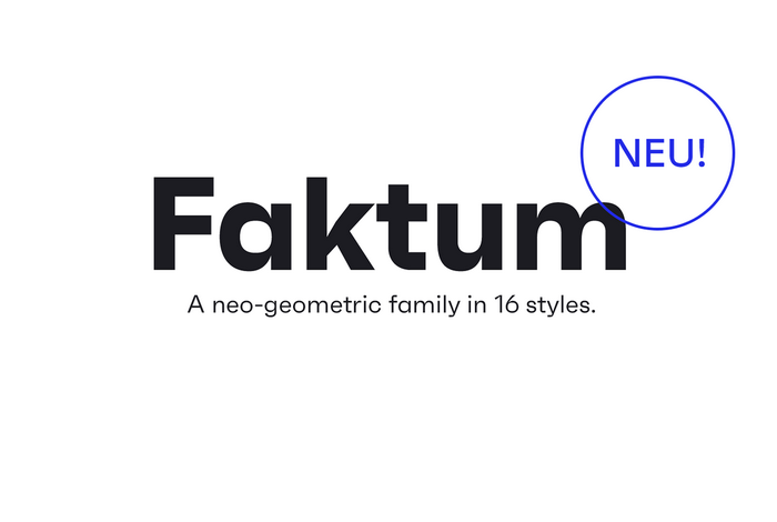
法克图
16个风格的新几何家族。
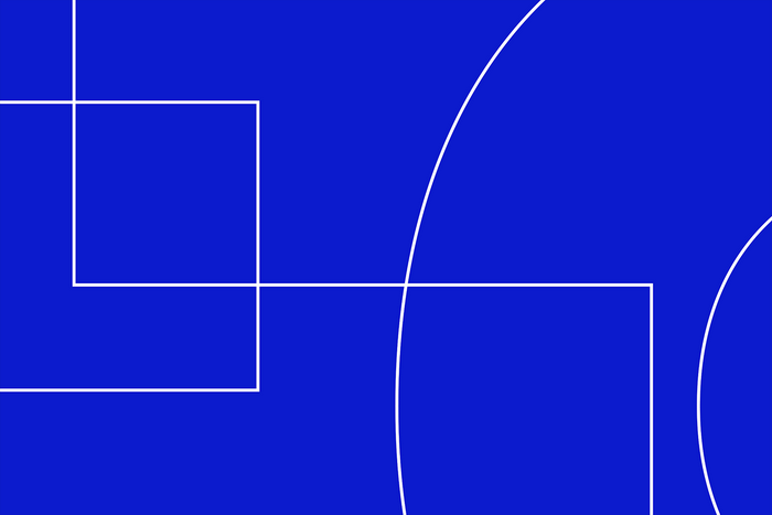
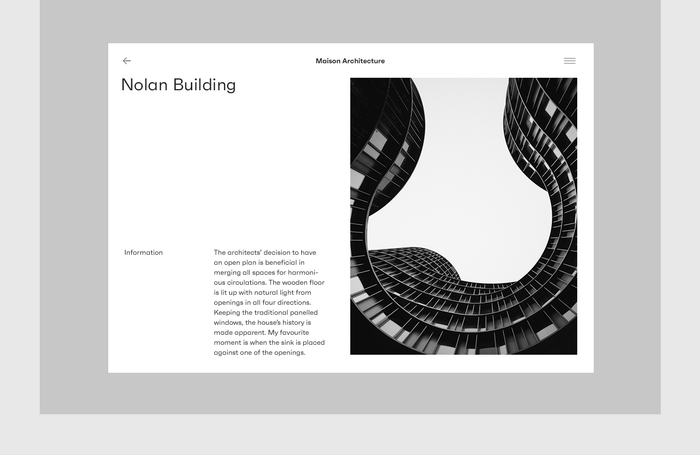
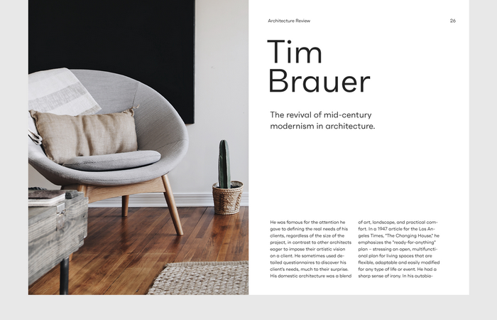
Faktum是对几何sans类型的探索,灵感来自中世纪的现代建筑和室内设计。 特别是清晰的线条,有机曲线和几何形状的结合,在20世纪下半叶的设计师和建筑师中非常受欢迎,为具有清晰的现代主义根源和强烈的现代感的设计提供了动力。
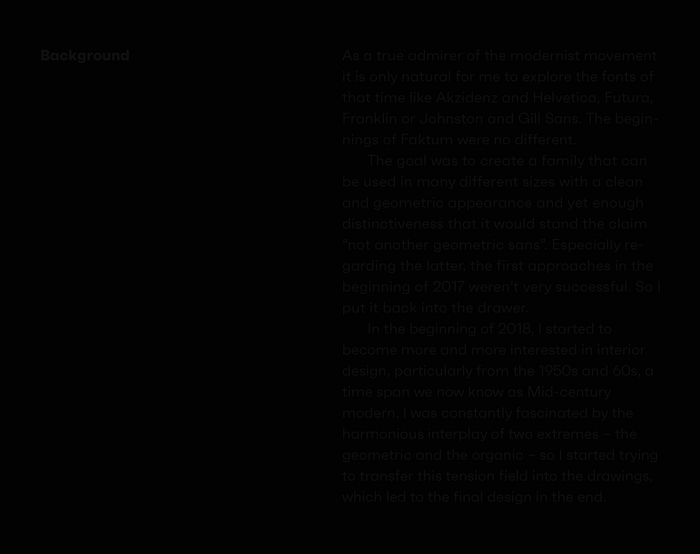
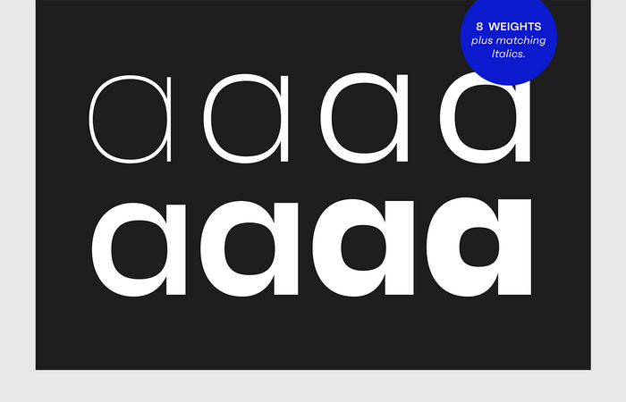
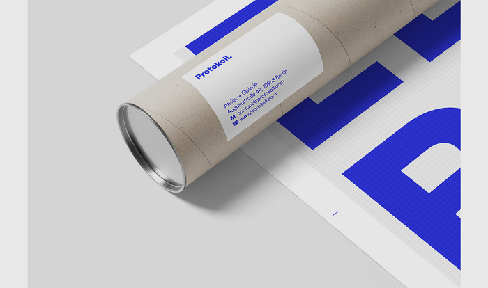
该系列有8个重量加上斜体匹配,具有多种替代字符和opentype功能,如自由选择的连字,区分大小写的形状,不同的数字集等等。 由于其简洁的线条和略微有机的结构,Faktum在许多尺寸和周围环境中都很有用,既可以作为长段中的限制性支撑字体,也可以作为强大标题中的主要演员。
Faktum
A neo-geometric family in 16 styles.
Faktum is an exploration into the geometric sans genre, inspired by Mid-century modern architecture and interior design. Especially the combination of clear lines, organic curves and geometric shapes, highly popular among designers and architects of the second third of the 20th century, gave The impetus for a design with clear modernist roots and a strong contemporary finish.
The family comes in 8 weights plus matching italics, featuring a wide range of alternate characters and opentype features like discretionary ligatures, case sensitive shapes, different number sets and many more. Due to its clean lines and slightly organic structure, Faktum functions great in many Sizes and surroundings, working either as a restrained supporting font in long paragraphs, or as a main actor in powerful headlines.


转载出处:www.behance.net/
