
CTS的新LOGO创作过程 哈喽大渣好,我是大湿!COOLOGO创始人,目前兼任纵贯线视觉主创,主要负责赛事品牌形象的策划与执行。

港真,我和宋承磊还是有很缘的,也很高兴能为CTS重新设计品牌形象。
首先,品牌LOGO设计必定是创始人的风格,如果老宋的品位和层次不到那个点,我想我也设计不出现在这个大家都觉得满意的方案。

所以,与其说是我设计的,不如说是老宋和我一起交流碰撞后得出的结果! 下面来说说CTS的新LOGO创作过程吧!
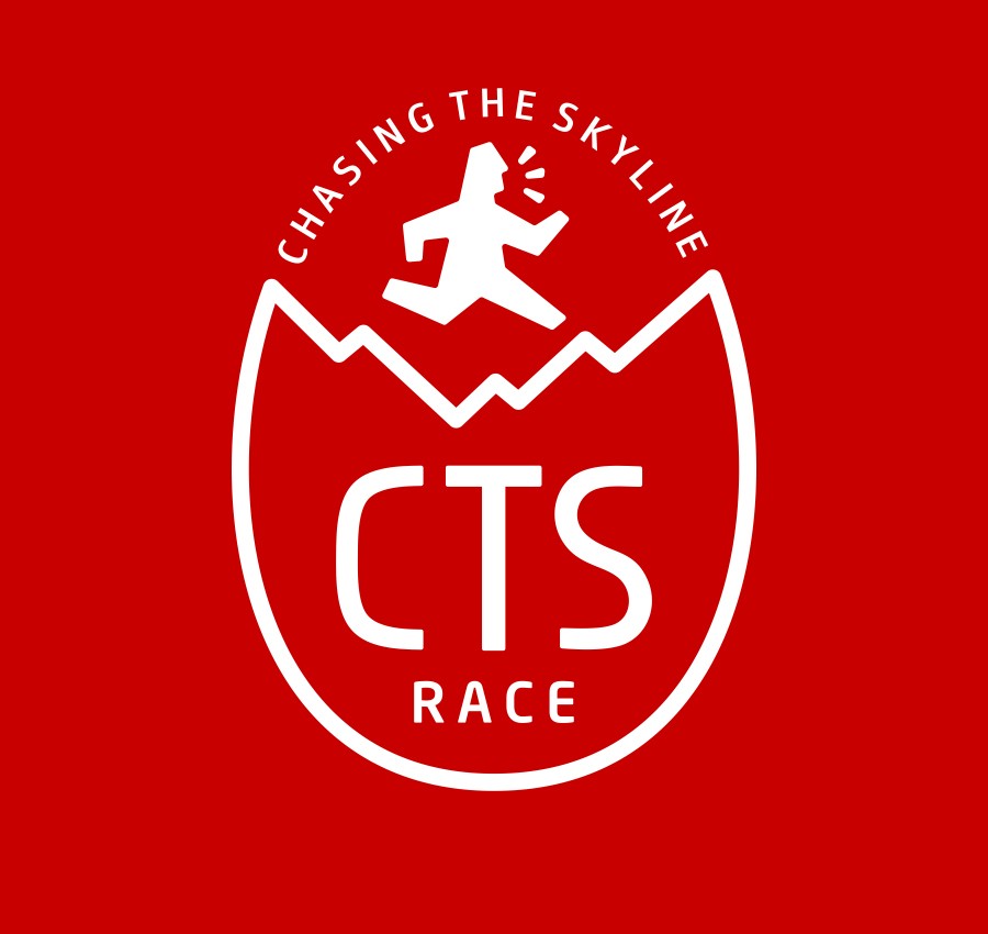
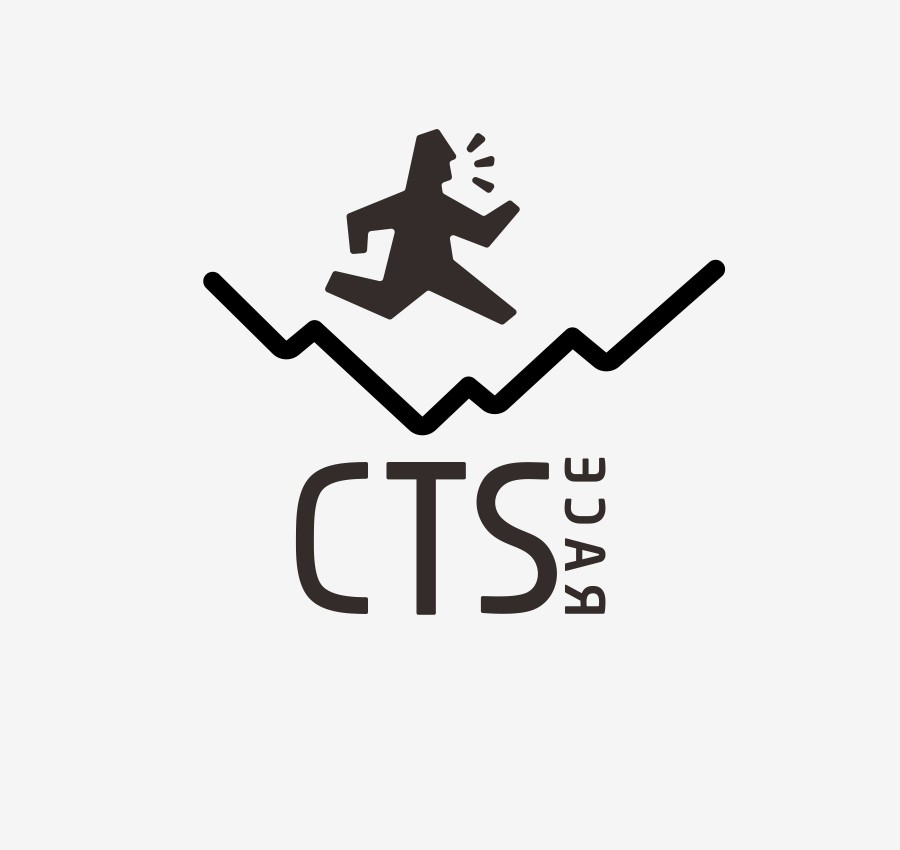
开始前老宋有3点要求:1、要有国际赛事品牌的感觉2、要简洁、精致、有特点3、要有人、有山(港真,要求还真不低!)大家都知道,全球越野赛品牌最牛的就是UTMB,整体简洁大方,使用起来特别方便,而让大家印象最深刻的就是那个奔跑的小人,比较有特点,容易让人记住,并且也直接的表达了越野赛事品牌的属性。 所以CTS新LOGO元素当中,要有一个奔跑的人,是一开始就达成的共识。你们以为一个普通的奔跑的人能忽悠得了老宋?最后大湿,实实在在的原创了一个小人,而且看上去是一个外国人(要有国际范啊!)。对了就是它。有人问了,为什么要加三个点?大湿想证明,他还在喘气!:)
好了,独一无二的奔跑的人完成了。现在要考虑山了大湿翻遍了所有的山,都大同小异。 这些山的形状,在很多越野赛品牌LOGO当中都用过了,怎么样才能让我们的山与众不同呢?就像画画一样,越是像的画,越没有想象空间,不如考虑得抽像一点吧。(这点是学UTMB的)如果我和你们说,原型是珠穆拉玛峰,你们信吗?但是酱子看好普通啊,还有点乱,有木有。所以大湿任性的将山倒了过来(我们不一样)。
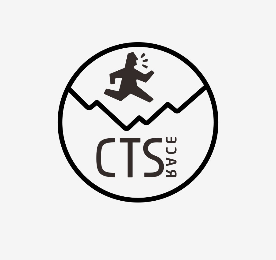
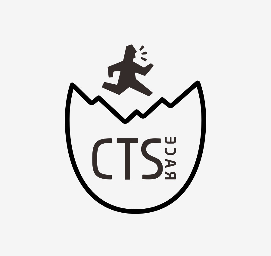
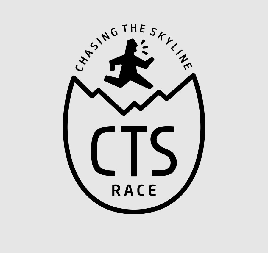
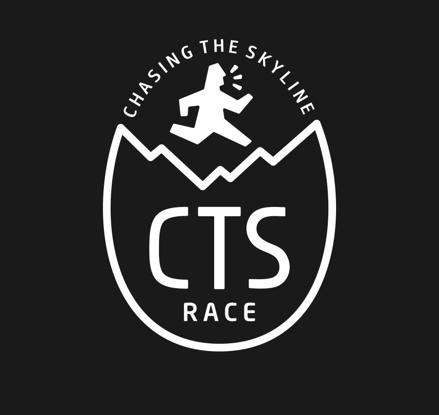
等一下,好像有点意思,我们的跑者本来就是在山里跑,谁会这么牛在山峰飞起来跑?(说得好有道理,我自己都差点信了!)但是总觉得好像少点什么,要不试试加个圆吧。一下子就整体好多了!不散了!但是,好像圆形也有点普通,而且看上去像个球。毕竟圆形的LOGO太多了。不如搞个椭圆吧!好了,基本的形看上去有点意思了,而且大湿还意外的发现了一个创意点,没错,其实很多伟大的创意,并不是一开始就想好的,而是在不断的尝试和摸索中跳出来的,如果我将上面的线给去掉,你们觉得像什么?是不是有点像一只立起来的蛋壳?是的,就是一只刚刚孵化了什么鬼动物的蛋壳。好了,下面开始将某种精神植入到这个图形,(注意:吹牛+忽悠模式启动) 孵化?破壳而处?突破?是不是与跑者的竞赛精神很接近?每一个越野跑者,都希望战胜自己!而最难的也是战胜自己!希望每一次的赛事都能突破自己,前面的任何障碍(蛋壳)都不是问题,每一位跑者要获得新生就必须经历磨练和挑战。 同时,也像征着CTS越野跑联赛,每一次都希望得到新的突破,能给每一位跑者创造更好的越野体验!(大湿吹起牛来,自己都怕!) 最后定稿,将英文信息进行组合整理。最后,老宋表示很喜欢,脱口而出“这TM就是我想要的”大湿觉得有这句话值了!
CTS's new LOGO creation process Hello, big dregs, I am wet! COOLOGO founder, is currently concurrently the main vertical line vision creator, mainly responsible for the event brand image planning and implementation. Hong Zhen, Song Chenglei and I are very happy. We are also happy to redesign the brand image for CTS. First of all, brand LOGO design must be the style of the founder, if Lao Song's taste and level is not that point, I think I can not design this everyone is satisfied with the scheme. So, rather than my design, it's the result of the collision between the old song and me. Let's talk about the new LOGO creation process of CTS. Before the beginning of the old Song Dynasty, there are three requirements: 1, to have a sense of international competitions brand 2, to be concise, exquisite, distinctive 3, to have people, have mountains (Hong Kong, the requirements are really not low!) As we all know, the best brand of cross-country race is UTMB, which is concise and easy to use. What impresses us most is the runner, who is characteristic, easy to remember, and also expresses the brand attribute of cross-country race directly. Therefore, there is a consensus among CTS's new LOGO elements to have a runner. Do you think an ordinary runner can fool the old song? Eventually Dashi, the real original man, looked like a foreigner (to be international!). Yes, that's it. Someone asked, why do we need to add three more points? Big wet wants to prove that he is still breathing. :) Well, the unique runner has done it. Now we must consider the mountains and the wet mountains, which are all the same. These mountain shapes, in many cross-country brand LOGO have been used, how can we make our mountain different? Just like drawing, the more like a picture, the less imaginative space. Consider taking a bit of it. (this is a study of UTMB) if I tell you, the prototype is Zhumu Lama, do you believe it? But the sauce is good, but it's a bit of a mess. So big wet and willful fall the mountain (we are different). Wait a minute. It seems interesting. Our runners were running in the mountains. Who would fly up the mountain like this? (well, I can hardly believe it! But always feel like something less, or try to add a circle. All of a sudden, the whole lot better! It's gone! However, it seems that the circle is a bit ordinary and looks like a ball. After all, there are too many round LOGO. Why not create an ellipse? Okay, the basic shape looks a little interesting, and the dampness unexpectedly finds an idea. Yes, a lot of great ideas, not from the beginning, but jump out in constant trial and error. What do you think if I take the top line off? Is it a bit like a standing eggshell? Yes, it is an eggshell that has just hatched what animal. OK, start to put some kind of spirit into this figure. Hatch? Where is the shell broken? Breach? Is it very close to the race spirit of runners? Every cross-country runner wants to overcome himself. And the hardest part is to beat yourself! Hope every race can break through their own, any obstacles in front (eggshell) is not a problem, every runner to get a new life must experience training and challenges. At the same time, also symbolizes the CTS cross-country race league, each time hope to get a new breakthrough, can give each runner to create a better cross-country experience! (big wet cattle blow, they are afraid!) Finalize the draft, and combine the English information. Finally, Lao Song said he liked it and blurted out that "this TM is what I want." Dashi thought it was worth it.