
马格诺葡萄酒
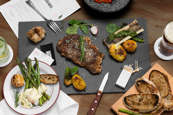
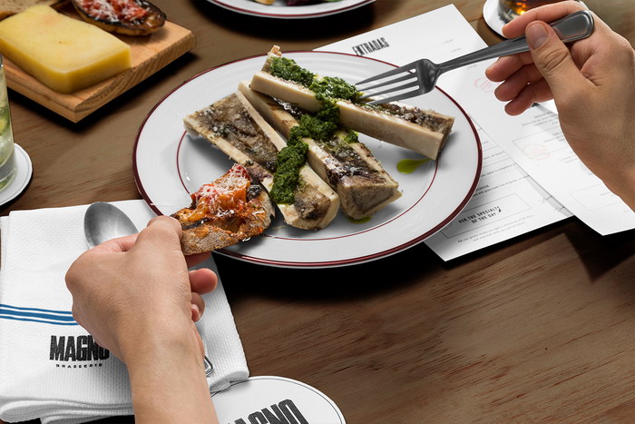
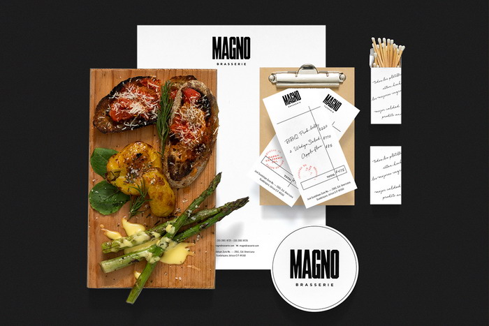
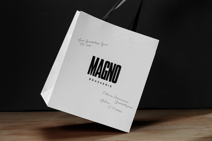
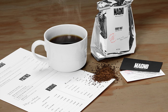
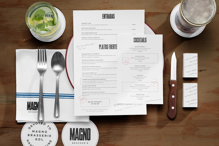
麦格诺BraseIe是一家专门经营墨西哥菜的餐厅,深受法国美食的启发。它位于墨西哥瓜达拉哈拉,并表示致力于提供使用最高品质的蛋白质作为主要成分的菜肴。视觉身份呈现出一种带有乡土气息和传统影响的阳刚之气。
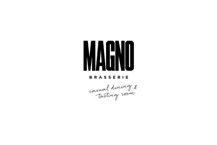
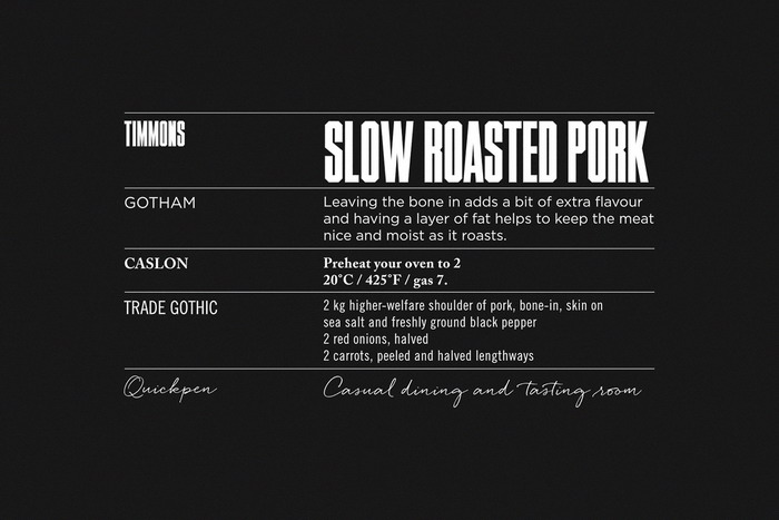
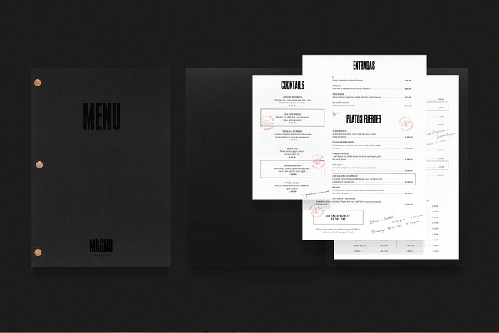
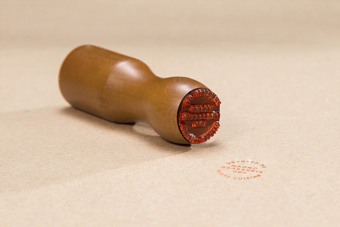
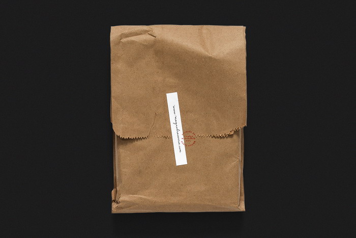
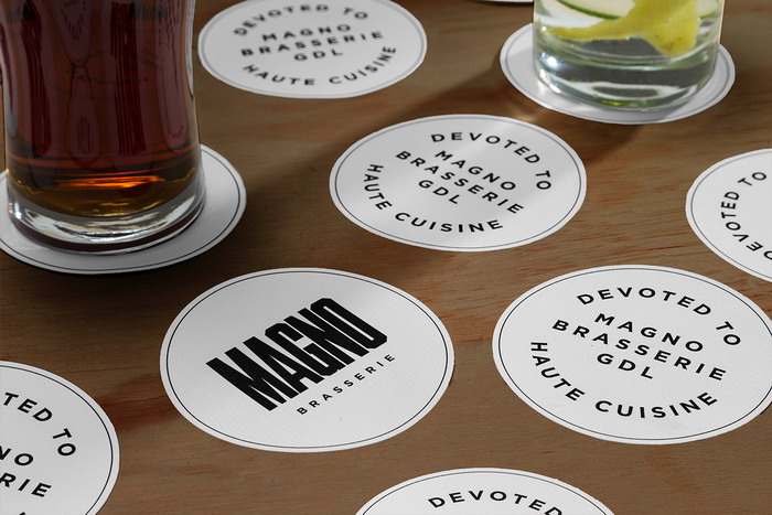
该品牌开始与一个相当大的视觉重量冲击字体标志。排版结合了草书手写,给它一个手工触摸。邮票上添加了一个乡土徽章,使其整个视觉线条保持一致性。皮革和木材的应用实现了概念的统一,赋予了品牌一种古色古香的美感。
MAGNO的品牌形象反映了品牌的诚意,其主要目标是:提供高品质的菜肴。
Magno Brasserie
Magno Brasserie is a restaurant specializing in Mexican dishes inspired by French cuisine. It is located in Guadalajara Mexico, and states its devotion to serving dishes that use the highest quality of protein, employing it as its main ingredient. The visual identity presents a sense of masculinity with rustic and traditional influences.
The brand starts with an impacting typographic logotype with considerable visual weight. The typography unifies the cursive handwriting, giving it an artisanal touch. A rustic emblem is added to the stamp, keeping consistency throughout its visual line. The leather and wood applications achieve concept unification, giving the brand an antique aesthetic.
Magno Brasserie’s identity reflects the brand sincerity with its main objective: Offering high quality dishes.